Tuesday, March 29, 2011

What to avoid...

My nerdy boyfriend likes to inform me daily of the dictionary.com "Word of the Day". I usually try to sound interested and excited, but most of the time it's really hard....love ya babe :) However, today it paid off! 

Today's "Word of the Day" is BEDAUB! 

Bedaub:
To overdecorate; to ornament showily or excessively.

Obviously, this is something that should be avoided when designing a space. Before selecting furniture or accessories for a room, you should always ask yourself:
  1. Is it necessary?
  2. Does it go with the current scheme? Just because it's nice doesnt mean it fits. 
  3. Will it complement the other items in your room, or will it overcrowd and clutter the space? 
  4. Is there an appropriate spot to put it? Even the best pieces can look awkward if not placed properly.
Simplicity is a key concept that every modern designer should keep in mind, so don't forget the cliche that "less is more", and listen to your nerdy boyfriends.

While this may not seem minimalist due to the abundance of
throw pillows, the lack of furniture and accessories otherwise
balances the space out accordingly. 

Often the key to success with minimalist designs
 is to work with a bold statement piece, and allow
it to be the sole focal point.  

Minimalism is the main concept behind any modern design. 

Monday, March 28, 2011

Design Inbox
Jamie's Master Bedroom

Jamie's small master bedroom presents a few design challenges, but with proper furniture proportions, textures, and color we cano create a chic and relaxing getaway for this newlywed couple. 

Here is the letter:  

Hi Megan,

I have a lot of pics of our bedroom and how it is now... The window is just over 7' wide and 57 1/2" in height. We have a queen size bed and the nightstand that you see I am looking at getting another one for the other side. I really want something that is cozy with a mix of modern elegance I would love to change our light fixture to a chandelier, I really love our current drapes. There is not a whole lot of wall space being the window takes up one wall and the closet takes up the other and the bathroom door and a small little nook takes up the other which cant be much more than 2' wide. I have just finished repainting a mirror black which I would like to use in our room as well, I do have a floating wall shelve that I have not yet found a place for. I do also love the rustic/modern look, and am open to color I want it chic but not too girly. Right now it is just way to plain and being that we just moved into our place in December the bdrm has been my last priority, I would love it as a little get away! Sorry for over loading you I just haven't found any inspiration that has wow'd me yet, I am open to color...I kind of like the idea of on one wall wide horizontal stripes same color just one flat and one high gloss....

 -Jamie


Neutral Chic Room Design


Design Breakdown: 

Headboard: This beautiful padded headboard was the driver for the entire design. The warm grey with the metal studs along the edges provides a great mixture of modern and rustic elements. 

Wall Color: Like Jamie mentioned in her letter, I think incorporating painted stripes in the bedroom is a great idea. The stripes could be painted either (a) light grey and white, or (b) both light grey, but with different finishes (gloss and matte). 

Bedding: Too much dark color can make a room seem quite small. Because Jamie's room is relatively small to begin with, we need to be very careful when selecting fabric colors. I would suggest using a light colored fabric for the main bedding, incorporating accent pillows in multiple textures and patterns. This way you can add darker features to the space while controlling the proportion of light and dark. 

Secondary Furniture: Rather than one nightstand, using two on either side of the bed helps balance the space and frame the focal point of the room (which is, of course, the bed!). Using two different styles of nightstand, we can introduce a unique asymmetry, while still maintaining spatial balance. All of the secondary furniture, including both nightstands, should be dark to neutralize the otherwise large abundance of light colors.

Lighting: This authentic chandelier brings a sense of drama and romance to the room. I would hang it directly above the bed to anchor the space, and shine a spotlight on the focal point. 

Drapery: I would hang drapes with a bold pattern that incorporates the whites and the greys in the room. Don't shy away from using a combination of different patterns and textures in a space! 

Artwork: A neat idea would be for each person to choose their favorite photo (e.g. magazine cover, favorite memory) and have them printed in black and white. Hang each picture above its respective nightstand, using the same frame for each, to add some personality to the room. 

Decorations: When choosing decorations, I suggest working with the finishes and textures already present in the room. Here, I would incorporate some stainless steel, glass, and mirror, to play off the chandelier and lamps. 

So, to wrap things up, remember to carefully balance color proportions when working with a small room, experiment with different textures and patterns, and always try to add some unique personality to make it feel like home!
~

Sunday, March 27, 2011

hi~lo
Glass Pendants
Lately I have found myself attracted to industrial style lighting. It looks great in residential spaces and creates a interesting contrast in formal environments.


Bubbled Barrel Pendant
Anthropologie
$798

vs

Globe Pendant
West Elm
$99-$279

~

Thursday, March 17, 2011

I heart this...

 Rocky Mountain Soap
Gardener with Yarrow

Tuesday, March 15, 2011

Mood Board
"Tiffany Blue" Dressing Room
...the next best thing to diamonds!


Sunday, March 13, 2011

Mood Boards
I came across this awesome program called "mydeco" (us.mydeco.com), which allows you to make personalized mood boards. This is a great way to illustrate your design ideas and express your creativity. I will regularly post interesting design schemes using this program, and hopefully inspire you on your next design project. Here's one to kick things off...


"Mellow Yellow" Living Room

hi~lo

Traditional Area Rugs
Lately I have been intrigued by the great patterns and colors found in area rugs. They are great for creating intimate spaces in a large room or giving a small room some extra warmth. 


Restoration Hardware
Anatolia Rug
Inspired by Traditional Turkish Rugs.
Price ranges from $289-$1949 depending on size.

VS


World Market
Agra Red Wool Rug
Made from 100% wool pile in India
$149
Various Sizes

VS

Ikea
Valby
Rug, low pile
Size: 6' 5"x 4' 4"
$99.99

~
Recipe Time: Coconut - Red Curry Pumpkin Soup


Here is a quick and healthy soup recipe I found that will warm you up on a cold winter day (or a typical spring day in Edmonton...) 


Ingredients:
3 cups chicken broth
1 (15 ounce) can pumpkin
2 teaspoons chili sauce with garlic
1/8 teaspoon curry powder
1 cup light coconut milk
1 tablespoon fresh lime juice
Chopped cilantro


Instructions: 
1. Combine the first five ingredients in a saucepan, stir till smooth. 
2. Add coconut milk and stir with whisk. 
3. Cook for one minute or until throughly heated. 
4. Remove from heat and add lime juice. 
5. Serve in bowls and sprinkle with cilantro. 
ENJOY!


I found this great recipe in the "Fall 2009 Weight Watchers 20 Minutes Recipe" Magazine. 
Just a side note...


For my 25th birthday, my amazing mother bought us both tickets to my favorite singer - Sarah McLachlan! So last weekend my mother and I witnessed the most incredible concert ever! I think Sarah McLachlan is one of most beautiful, talented, and funniest artists alive. Here is my favorite song - "Possession".


 Thanks Mom!
~

Wednesday, March 2, 2011

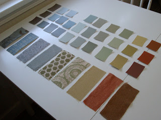
Fabric + Inspiration = Color Direction

Whenever I am deciding on a direction for a design, I always look for inspiration in either textiles, artwork, or nature. If you already love something why not pull from that element to create the foundation for your design. 

Here, I am using some fabrics to create a color scheme for a friends home.


As you can see I ended up with a lot of different colors. The reason I did this was because I could then create a couple different color scheme using all of these colors. For example, I can create a vivid, energetic scheme with the brighter colors or I can create a earthy, relaxed scheme with the softer more neutral colors. 
~

hi~lo
Design doesn't need to be expensive. I believe you can create a "high priced" look for a fraction of the cost - you just have to be willing to search for the deal. Here, I will show you a "hi", or expensive piece and show you the "lo", or budget-friendly, version. This way, anyone can create a high-end look using a low-end budget.

Vintage Inspired Storage Trunks

We all know I love vintage elements in any home. I enjoy the idea of using a unique peice in an conventional space. You can find a vintage-inspired storage trunk in many retail stores, which can be used as a coffee table, side table, storage unit, or a storage bench at the foot of your bed.


Restoration Harware
Mayfair Steamer Large Trunk Vintage Cigar Leather
$1495

 vs


Pottery Barn
Expedition Trunk
$1299.00

vs


World Market
 Steamer Trunk Cocktail Table
$249.00
~